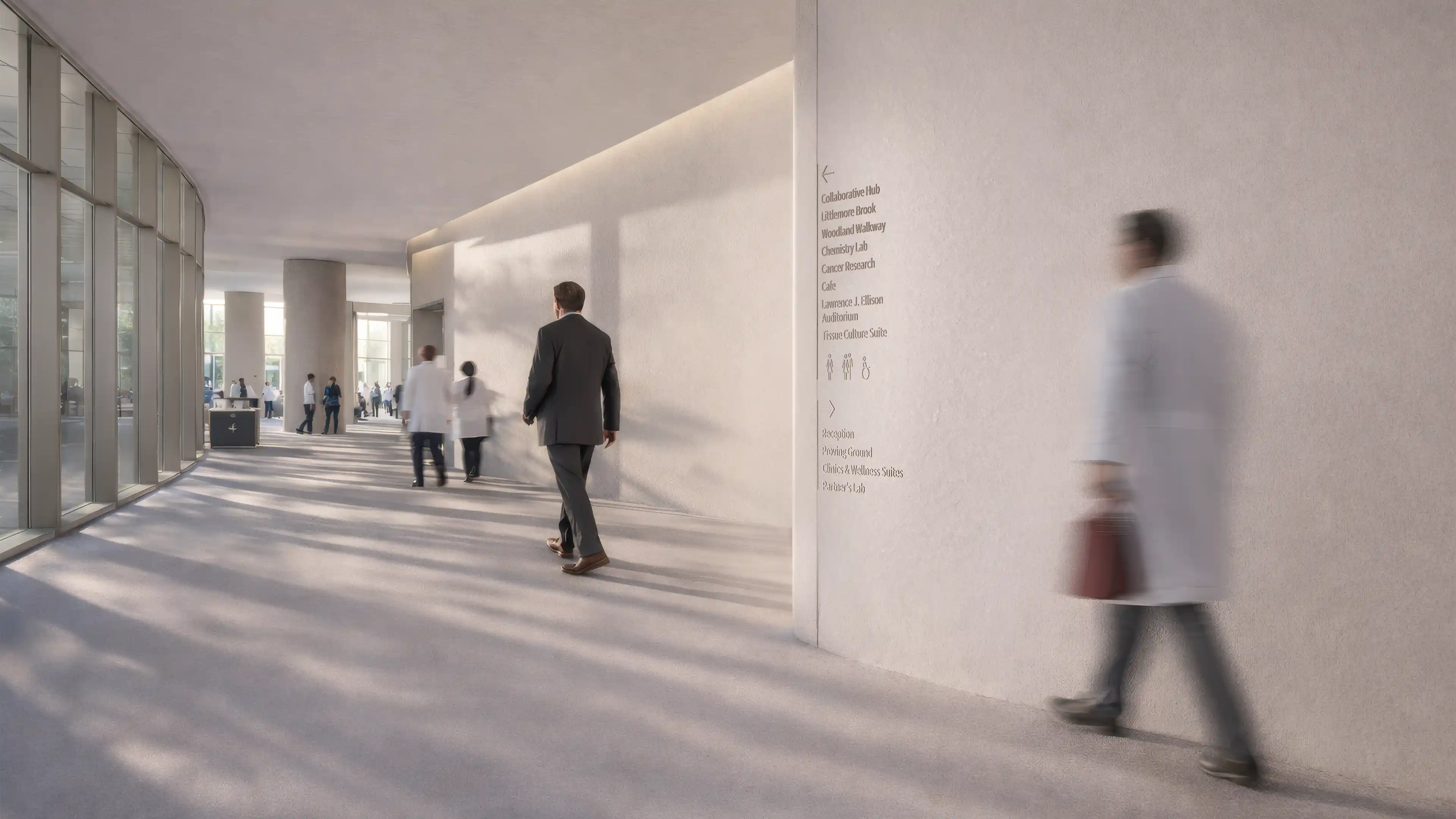



Accessible wayfinding design addresses that gap. It helps people recognise where they are, understand their options and reach a destination with as much independence and choice as possible. It connects the accessibility of the physical route with the accessibility of the information needed to use it.
For a developer or operator, the useful question is specific: can a person complete the intended journey, including the return, using the information and facilities actually available at that time? A collection of compliant components cannot answer that question on its own.
Assess access through a complete journey
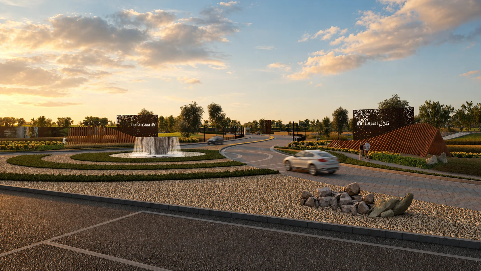
Begin before the entrance. A visitor may need to choose a parking area, identify a drop-off point or work out which public transport exit serves the building. If the pre-arrival instructions send them to an entrance with steps, explaining the alternative inside the lobby comes too late. Map the route through arrival, orientation, changes of level, destination recognition and departure. Include transitions between responsibilities. A route can be clear within a shopping centre and become ambiguous at the boundary with a transport concourse because the two operators use different names for the same entrance.
The UK Department for Transport's Inclusive Mobility guidance addresses access to pedestrian and transport infrastructure for disabled people while also considering other users. Its journey context is useful beyond transport: an accessible building does not function independently of the approach to it. The project team still needs to establish which local requirements apply to its own site.

Understand different needs without treating users as categories
A visual-only instruction may exclude someone who cannot see it. Spoken guidance may be inaccessible to someone who cannot hear it. An accurate map can be difficult to use if its orientation, detail or language makes the next action unclear.
These are different design problems. Blind and partially sighted people do not all use the same navigation methods. People with cognitive disabilities, neurodivergent people and people with acquired impairments have varied preferences and capabilities. Consultation should discover what enables the particular journeys, rather than assign one solution to a broad label.
Limited language familiarity, temporary injury, fatigue and stress also affect how a person uses information. They deserve consideration without being presented as equivalent to disability. An international visitor reading an unfamiliar script and a person with a long-term cognitive impairment may encounter some similar barriers, but their needs and experiences are not interchangeable.
Record access needs alongside journey tasks. Can the visitor locate the lift before reaching the stairs? Can they identify their floor on arrival? Can they ask for help through a channel they can use? This makes the brief actionable.
Make the usable route apparent before the routes separate
Consider a hypothetical cultural venue with a prominent stair and a step-free route through a side corridor. A symbol at the stair does little to help someone who has already crossed the lobby, joined a queue and reached a barrier.
Review where route choice begins. Communicate the available options before that point, identify the alternative clearly and provide confirmation along it. Where possible, integrate the step-free route into the main arrival experience. Where separation is unavoidable, assess the detour, operating hours, security arrangements and destination approach as a complete route.
The wayfinding team should expose these conditions while architects and operators can still respond. A navigation instruction cannot make an unavailable entrance usable or remove a physical obstacle. The required change may belong to planning, access control or operation rather than communication.
Use consistent information to strengthen clarity
Consistency helps people carry an understanding from one part of a journey to another. A destination called East Clinic in an appointment message should not become Outpatients B at the entrance and Ambulatory Services at the lift.
Agree a controlled destination list across maps, booking information, directories, digital interfaces and staff instructions. For multilingual environments, maintain the relationship between the approved names in each language. Translation needs review in context, including whether the displayed name matches the words a visitor has already received.
Consistency alone is insufficient. Repeating an unfamiliar abbreviation throughout a building does not make it understandable. Test whether people recognise the destination and can act on the instruction. Plain language, a clear hierarchy and recognisable confirmation make the consistent system useful.
Colour can reinforce a zone, but pair it with a name, number or other identifiable cue. The route should remain understandable when colour distinctions are unavailable or difficult to perceive.

Give information through appropriate complementary channels
The aim of a multisensory approach is to offer usable ways to obtain essential information. It does not require filling every space with more sound, light or graphics.
Visual communication needs consideration of contrast, glare, viewing distance, lighting and obstruction. Tactile information must be discoverable and reachable. Audio information needs a suitable listening environment and an alternative for people who cannot use it. The right combination depends on the task, location and applicable requirements.
The U.S. Access Board's ADA guidance distinguishes visual and tactile requirements according to sign type and content. That distinction matters: placing braille on an overhead directional sign is not a substitute for planning accessible information at a usable location. The ADA example is specific to the United States and should not be treated as the governing rule for a project elsewhere.
Digital guidance can offer additional formats and route information, but essential navigation should remain usable when a visitor has no compatible phone, no connection or no desire to use an application. Give people a practical alternative and explain how to obtain assistance without making it a hidden service.

Test decisions with the people who need to make them
A design review can confirm that the intended information is present. User testing asks whether someone can find and use it. Both are necessary, and they answer different questions.
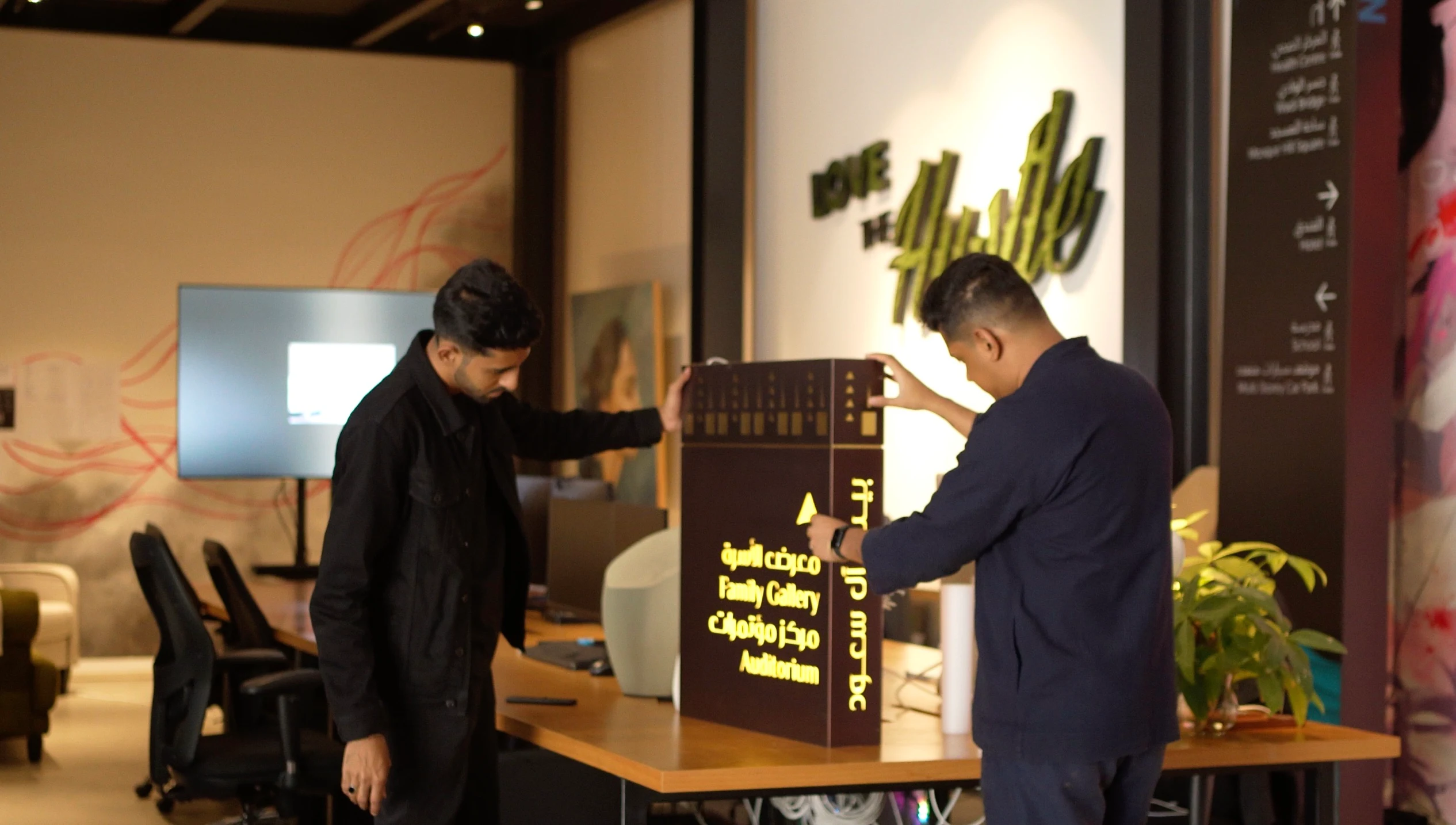
Recruit participants whose access needs are relevant to the site, compensate them appropriately and agree accessible research arrangements. Give them realistic tasks with an agreed protocol for assistance. Observe where they hesitate, miss a cue, misinterpret a destination or lose confidence after a change of level. Invite their explanation rather than infer the cause from movement alone. Test prototypes before committing to permanent products. A full-size sample under representative lighting may reveal problems that a screen presentation cannot. A route walk can expose a missing transition between two otherwise clear areas.
Record the task, conditions, outcome and requested support. A small exercise can identify specific barriers; it cannot establish that every user will navigate successfully. Re-test the changed condition and keep unresolved access issues visible to the client.
Keep accessible navigation usable as the place changes
A lift closure, tenancy move or evening entrance arrangement can invalidate an otherwise effective route. Assign responsibility for updating pre-arrival instructions, physical information, digital maps and staff guidance together.
Temporary changes need the same journey discipline as permanent design. Tell people about an inaccessible route before they commit to it. Check that a diversion is physically usable, clearly described and available throughout the stated hours. Remove obsolete instructions when normal operation resumes.
Measure independence through defined tasks rather than relying on a general satisfaction score. Record successful arrival, wrong turns, requests for assistance and the reasons people needed help, while recognising that asking for support can be a valid personal choice. Review outcomes by relevant user needs so an overall average does not hide a persistent barrier.
Within Built Environment Experience Design, accessible navigation connects spatial decisions, information and operation. The practical test is whether the person can understand and use the place on their own terms. That test belongs in the brief, the design review and the operating routine.